Catalyst Support
Catalyst promotes mental health and wellbeing across Surrey, supporting people to improve stability and reduce harm to themselves, their families and their communities.
Delivering 21 specialised services across a network of partner charities, Catalyst needed a cohesive visual identity. I was brought on board to unify the design across all services and partnerships.
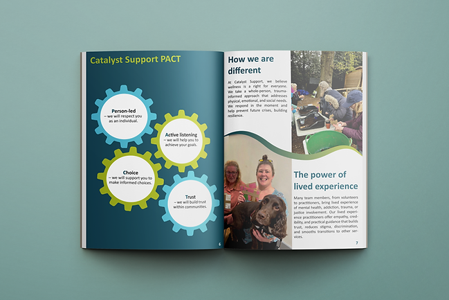
While Catalyst had established brand colours, typography and imagery, it lacked a unified visual language. I developed a flexible design system that could adapt across services while aligning with partner brands. Client: Catalyst Support Deliverables: Branding


Guided by the organisation’s ethos of non-judgmental care and togetherness, organic shapes, rounded corners and hand-drawn elements were used to create a warm, approachable and recognisable identity.